Each of the WPF graphical rendering options (shape, drawing and geometries, and visuals) makes extensive use of brushes, which allow you to control how the interior of a 2D surface is filled. WPF provides six different brush types, all of which extend System.Windows.Media.Brush. While Brush is abstract, the descendents described in Table 29-4 can be used to fill a region with just about any conceivable option.
Table 29-4. WPF Brush-Derived Types
| Brush Type | Meaning in Life |
|---|---|
| DrawingBrush | Paints an area with a Drawing derived object (GeometryDrawing, ImageDrawing, or VideoDrawing) |
| ImageBrush | Paints an area with an image (represented by an ImageSource object) |
| LinearGradientBrush | Paints an area with a linear gradient |
| RadialGradientBrush | Paints an area with a radial gradient |
| SolidColorBrush | Paints a single color, set with the Color property |
| VisualBrush | Paints an area with a Visual derived object (DrawingVisual, Viewport3DVisual, and ContainerVisual) |
The DrawingBrush and VisualBrush classes allow you to build a brush based on an existing Drawing or Visual derived class. These brush classes are used when you are working with the other two graphical options of WPF (drawings or visuals) and will be examined later in this chapter.
ImageBrush, as the name suggests, lets you build a brush that displays image data from an external file or embedded application resource, by setting the ImageSource property. The remaining brush types (LinearGradientBrush and RadialGradientBrush) are quite straightforward to use, though typing in the required XAML can be a tad verbose. Thankfully, Visual Studio 2010 supports integrated brush editors that make it simple to generate stylized brushes.
Let’s update our WPF drawing program, RenderingWithShapes to use some more interesting brushes. The three shapes we’ve employed so far to render data on our toolbar use simple, solid colors, so we can capture their values using simple string literals. To spice things up a tad, we will now use the integrated brush editor. Ensure that the XAML editor of your initial window is the open window within the IDE, and select the Ellipse element. Now, locate the Fill property in the Properties window, and click the dropdown list. You should now see the following brush editor (Figure 29-7).
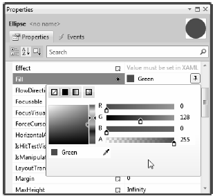
Figure 29-7 Any property that requires a brush can be configured with the integrated brush editor
As you can see, this editor contains four slider controls, which allow you to set the ARGB (alpha, red, green and blue, where “alpha” controls transparency) of the current brush. Using these sliders and the related color selection area, you can create any sort of solid color. Go ahead and use these tools to change the color of your Ellipse, and view the resulting XAML. You’ll notice the color is stored as a hexadecimal value, for example:
<Ellipse Fill="#FF47CE47" Height="35" Width="35" />
More interestingly, this same editor allows you to configure gradient brushes, which are used to define a series of colors and transition points. On the upper-left of the brush editor, you will see four small buttons, the first of which lets you set a null brush for no rendered output. The other three allow you to set up a solid color brush (what we just examined), gradient brush, or image brush.
Click the gradient brush button and the editor will display a few new options (see Figure 29-8). The three buttons on the lower left allow you to pick a vertical, horizontal, or radial gradient. The bottommost strip will show you the current color of each gradient stop, each of which is marked by a “thumb“ on the strip. As you drag these thumbs around the gradient strip, you can control the gradient offset. Furthermore, when you click on a given thumb, you can change the color for that particular gradient stop via the color selector. Finally, if you click directly on the gradient strip, you can add additional gradient stops.
Take a few minutes to play around this editor to build a radial gradient brush containing three gradient stops, set to your colors of choice. Figure 29-8 shows the brush I just constructed, using three different shades of green.
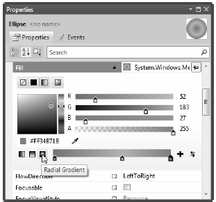
Figure 29-8 The Visual Studio brush editor allows you to build basic gradient brushes
Once you are done, the IDE will update your XAML with a custom brush set to a brush-compatible property (the Fill property of the Ellipse in our example) using property-element syntax. For example:
<Ellipse Height="35" Width="35">
    <Ellipse.Fill>
        <RadialGradientBrush>
            <GradientStop Color="#FF87E71B" Offset="0.589" />
            <GradientStop Color="#FF2BA92B" Offset="0.013" />
            <GradientStop Color="#FF34B71B" Offset="1" />
        </RadialGradientBrush>
    </Ellipse.Fill>
</Ellipse>
Now that we have built a custom brush for the XAML definition of our Ellipse, the corresponding C# code is out of date, in that it will still render a solid green circle. To sync things back up, update the correct case statement to use the same brush you just created. Here is the necessary update, which looks more complex than you might expect, just because we are converting the hexadecimal value to a proper Color object via the System.Windows.Media.ColorConverter class (see Figure 29-9 for the modified output):
case SelectedShape.Circle:
    shapeToRender = new Ellipse() { Height = 35, Width = 35 };

    // Make a RadialGradientBrush in code!
    RadialGradientBrush brush = new RadialGradientBrush();
    brush.GradientStops.Add(new GradientStop(
        (Color)ColorConverter.ConvertFromString("#FF87E71B"), 0.589));
    brush.GradientStops.Add(new GradientStop(
        (Color)ColorConverter.ConvertFromString("#FF2BA92B"), 0.013));
    brush.GradientStops.Add(new GradientStop(
        (Color)ColorConverter.ConvertFromString("#FF34B71B"), 1));

    shapeToRender.Fill = brush;
    break;
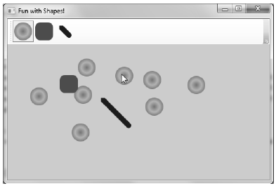
Figure 29-9 Drawing circles with a bit more pizzazz!
By the way, you can build GradientStop objects by specifying a simple color as the first constructor parameter using the Colors enumeration, which returns a configured Color object:
GradientStop g = new GradientStop(Colors.Aquamarine, 1);
Or, if you require even finer control, you can pass in a configured Color object. For example:
Color myColor = new Color() { R = 200, G = 100, B = 20, A = 40 };
GradientStop g = new GradientStop(myColor, 34);
Of course, the Colors enum and Color class are not limited to gradient brushes. You can use them anytime you need to represent a color value in code.
In comparison with brushes, a pen is an object for drawing borders of geometries, or in the case of the Line or PolyLine class, the line geometry itself. Specifically, the Pen class allows you to draw a specified thickness, represented by a double value. In addition, a Pen can be configured with the same sort of properties seen in the Shape class, such as starting and stopping pen caps, dot-dash patterns, and so forth. For example:
<Pen Thickness="10" LineJoin="Round" EndLineCap="Triangle" StartLineCap="Round" />
In many cases, you won’t need to directly create a Pen object, as this will be done indirectly when you assign a value to properties, such as StrokeThickness to a Shape derived type (as well as other UIElements). However, building a custom Pen object is very handy when working with Drawing derived types (described later in the chapter). Visual Studio 2010 does not have a pen editor, per se, but it does allow you to configure all of the stroke-centric properties of a selected item using the Properties Window.